A consistent identity
The logo fits light and dark surfaces. Black and silver anchor the palette, with a touch of vermilion for accents.
The Obsela project
Our own studio as a space for expression. An internal project combining visual identity, design and web development.

The intention
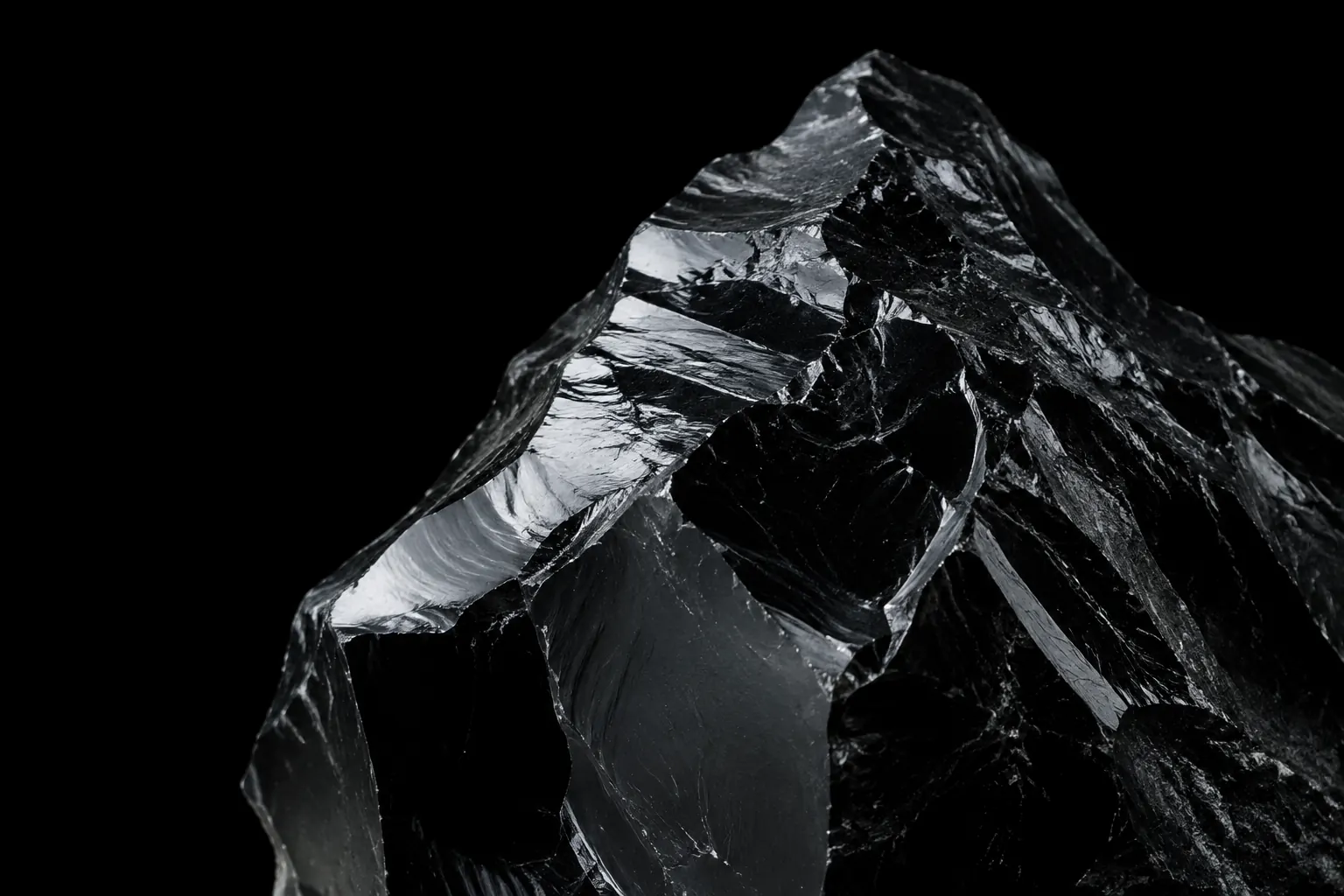
The starting point: a geometric symbol with contrasting facets and a clean wordmark. The website extends this language with generous space, clear contrasts and moving details.

Design decisions
The logo fits light and dark surfaces. Black and silver anchor the palette, with a touch of vermilion for accents.
Services, offers and practical questions each have their own pages to help visitors move forward according to their needs.
Titles appear, sections reveal themselves and interactions respond to hovering. Animations respect reduced-motion preferences.
The form lets visitors describe their project, choose a service and specify useful options. Budget and preferred timing remain optional, making an initial conversation possible even when the requirements are still taking shape.
View the enquiry formThe pages are available in French, German, Italian and English. The language selector keeps visitors on the same page so they can find the same service or information in another language.
Explore our website design service